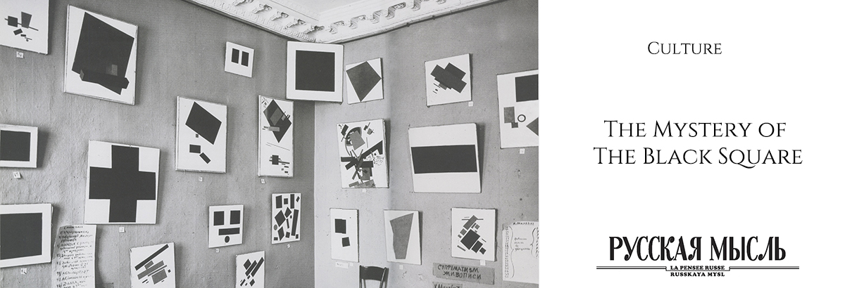
The 145th anniversary of the birth of Kazimir Malevich
By Oksana Kopenkina, art analyst, founder of the Arts Diary & Pad website
Probably, everyone thought about the paradox of Malevich’s Black Square. You can’t think of anything easier than a black square. There is nothing easier than drawing a black square… Nevertheless, it is recognized as a masterpiece. If today it goes to open auction, collectors will buy it for 140 million dollars!
Obviously, there is something special about The Black Square. Invisible to the ordinary viewer. It only at first glance seems that such a masterpiece could be created by everyone: both a child and an adult without art education. But not everything in this picture is so simple.
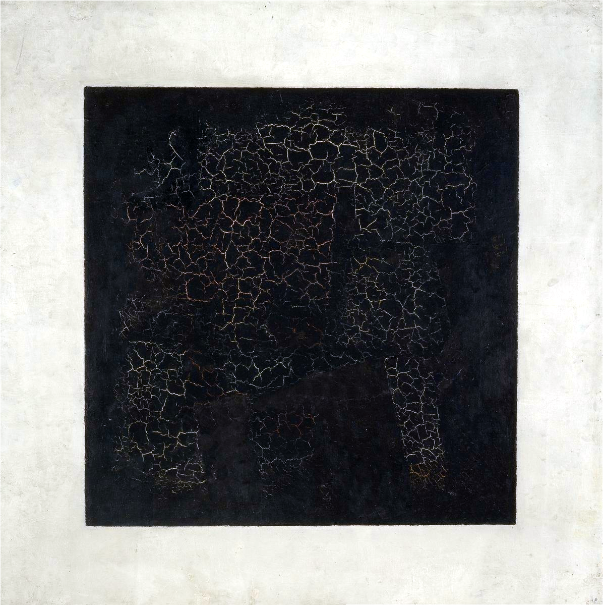
The Black Square is not really a square. Its sides are not equal. And the opposite sides are not parallel to each other. In addition, The Black Square is not completely black.
Chemical analysis showed that Malevich used three home-made paints. The first is burnt bone. The second is black ochre. And the third is natural dark green component. Malevich also added chalk to remove the gloss effect of oil paints.
That is, the artist did not just take the first black paint and draw the square. At least he spent a day preparing materials.
If it were an accidentally painted picture, the artist would not copy it. Over the next 15 years, he created three more Black Squares. If you saw all four paintings (two are stored in the Tretyakov Gallery, one in the Russian Museum and one more in the Hermitage), then you probably noticed how much they are not similar. The first Square of 1915 is considered the most energetically charged. The thing is in the successful selection of shades of black and white, as well as in the composition of colors.
All four paintings are not similar either in size or colour intensity.
On the Square in 1915, you probably noticed cracks (craquelure). The bottom layer of paint is visible through it. These are the colours of a different picture. It was written in proto-suprematist style.
That’s not all. Below it is another image. Already the third in a row. Written in the style of cubo-futurism. Therefore, craquelures appeared. Too thick paint.
Why such difficulties? As many as three images on one surface!
Perhaps this is an accident. It happens. The artist has an idea. He wants to express it right away. But there may not be a canvas at hand. But even if there is a canvas, it needs to be prepared, primed. Then insignificant pictures are used. Or those that the artist considers unsuccessful.
It turned out a kind of picturesque nesting doll. Evolution. From cubo-futurism to cubo-suprematism and to pure suprematism in The Black Square.
Suprematism
Malevich came up with a new direction in painting: Suprematism. The Black Square was created as part of this direction.
Supreme means excellent. Since the artist considered it the highest point in the development of painting. This is a whole school. Like impressionism. Like academism. Only this school was created by one person. Kazimir Malevich. He attracted many supporters and followers.
Malevich was able to talk about his brainchild clearly and charismatically. He urged to completely abandon figurativeness, that is, from the image of objects. Suprematism is an art that creates, not repeats, as the artist said.
If we remove the pathos and look at his theory from the side, then we cannot but recognize its greatness. Malevich, as befits a genius, felt in which direction the wind was blowing. The time of individual perception was running out. Now came the age of mass culture, built on simplified forms and pure colours. Malevich understood that art should not lag behind. Or maybe even able to lead this movement.
He invented, in fact, a new pictorial language. Proportional to the coming time, which is about to come. And the language has its own alphabet.
The Black Square is the main sign of this alphabet. “Zero forms”, as Malevich said.
Before Malevich, there was another alphabet invented by Giotto at the beginning of the XIV century. This alphabet was the basis of all art. This is a perspective, volume, emotional expressiveness.
Malevich has a completely different language. Simple forms in which colour is given a different role. It is not to convey nature. And not to create the illusion of volume. It is expressive by itself.
The Black Square is the main “letter” in the new alphabet. Square, because it is the first form. Black colour because it absorbs all colours.
Malevich also creates The Black Cross and The Black Circle. Simple elements. But they are also derivatives of the black square.
A circle appears if the square is rotated on a plane. The cross consists of several squares.
Then Malevich from his alphabet adds new “words”. It combines colour forms in simple, complex, and very complex combinations.
Malevich worked in the style of Suprematism for several years. And then the incredible happened. He suddenly returned to figurativeness, which he had denied for so long… One could regard this as inconsistency. Like, “played” a beautiful theory and that’s enough. In fact, this language wanted to be used in the world of forms. And Malevich obediently returned to this world. But portrayed him using the new language of Suprematism.
So, The Black Square is not the end of art, as it is sometimes called. This is the beginning of a contemporary art.
Then came a new stage. Language wanted to serve people. And it passed into our lives.
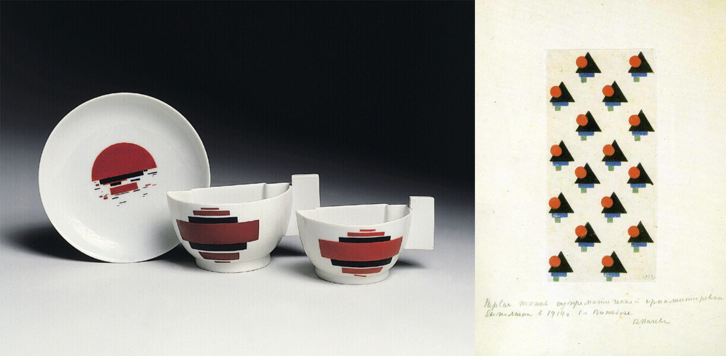
Having created Suprematism, Malevich did everything so that it would not gather dust in museums but would go to the masses. He also painted porcelain. He created patterns for fabrics. He drew sketches of dresses. But during his life he was able to “put it on” only on the heroes of his paintings.
Malevich’s supporters spoke in the language of The Black Square. The most famous of them is El Lissitzky, who invented printed fonts, as well as a new book design. He was inspired by the theory of Suprematism and The Black Square by Malevich.
This design of books seems natural to us. But only because Malevich’s style has firmly entered our lives. Our contemporaries – designers, architects and fashion designers, admit that they often find inspiration in the works of Malevich. Among them is one of the most famous architects, Zaha Hadid (1950–2016).
The Black Square as the letter of the alphabet
Almost every viewer tries to understand Malevich with the help of a familiar language. The language of the naturalistic image that Giotto invented in the 14th century, and which was subsequently developed by Renaissance artists.
Many are trying to evaluate Black Square by inappropriate criteria. Like – not like. Beautiful – not beautiful. Realistic – not realistic.
Awkwardness appears. Discouragement. Because The Black Square remains deaf to such estimates. What is left? Only condemn or ridicule.
Nonsense. “The child will draw better” or “I can do that too” and so on.
Now evaluate The Black Square as the letter of the alphabet. Like an atom of a molecule. Like an electron of a magnetic field. Then it will become clear why this is a masterpiece. It is impossible to evaluate The Black Square on its own. But only with the space that he serves.
***
Malevich was famous during his lifetime. But he did not receive material benefits from this. Once he decided to attend an exhibition in Paris (1929). And he asked the authorities to let him go there … on foot. Because he had no money for the road. The authorities realized that an artist who came to the exhibition on foot would undermine their authority. Therefore, 40 rubles were allocated for the trip.
But after 2 weeks he was urgently called by telegram back. And on arrival he was immediately arrested. On a denunciation. Like a German spy.
No more shows. No Suprematism. In the USSR, only social realism was possible.
The artist died in 1935.

